-
-
Notifications
You must be signed in to change notification settings - Fork 53
Control Types
- Introduction
- Input fields
- Button types
- Drawer
- Display Types
- Dialogs
- TabSet
- ContextMenu
- Delegates
- Misc types
This page describes the various types of controls used in the Main GUI & Test Bench that are configurable in a Style file.
To modify the individual styles you would also need to know the name of each control.
As the name suggests, these are used for obtaining a input from the user typed in via keyboard OR filled by an associated action.
This is used for accepting integer values. Currently only used by [Input Dialog]

It has the following color keys:
inactiveBG-
activeBG(i.e. when focused) inactiveBorderactiveBorderinactiveTextactiveTextselectedBGselectedText-
disabledIndicator(Used for the+and-on either side) -
activeIndicator(Used for the+and-on either side)
This is used for accepting floating point values. Currently only used by [Input Dialog]

It has the following color keys:
inactiveBG-
activeBG(i.e. when focused) inactiveBorderactiveBorderinactiveTextactiveTextselectedBGselectedText-
disabledIndicator(Used for the+and-on either side) -
activeIndicator(Used for the+and-on either side)
This is used for accepting single line texts.
It appears either in a rounded box

or with just a line underneath

It has the following color keys:
-
background(common BG for active & inactive states) inactiveBorderactiveBorderinactiveTextactiveText-
placeholder(Color for the hint text) -
selectedBG(For character selection by mouse or keyboard) -
selectedText(For character selection by mouse or keyboard) -
titleText(Color for the optional title for the rounded box. Only certain cases have it like the Source field in Main GUI) -
cursor(Color for the text cursor)
This is used for accepting multi line texts. At present only the Output and Script Editor sections in Script Window & Results tab of Test Bench make use of these.
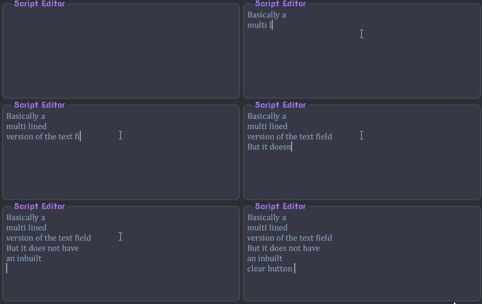
It has the following color keys:
inactiveTextactiveText-
selectedText(For character selection by mouse or keyboard) -
selectedBG(For character selection by mouse or keyboard) -
cursor(Color for the text cursor)
The buttons available are either simply clickable, switches between an ON/OFF state, or presents a dropdown list.
This is a simple push button containing a descriptive text and implementing a specific action upon clicking.
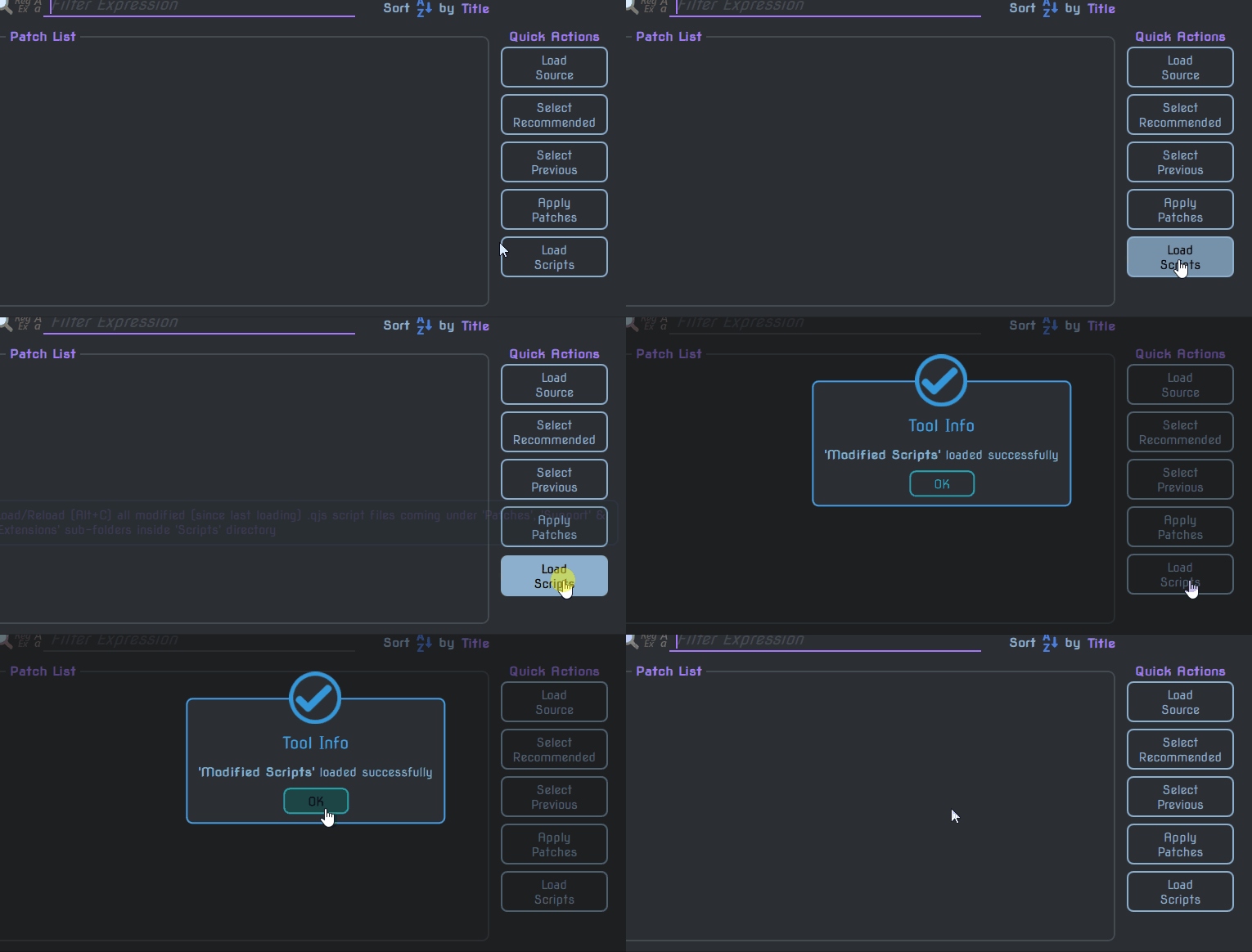
It has the following color keys:
inactiveBGhoveredBGpressedBGinactiveBorderhoveredBorderpressedBorderinactiveTexthoveredTextpressedText-
tipBG(Background for tooltip) -
tipBorder(Border for tooltip) -
tipText(Text color for tooltip)
Functionally an ImageButton is identical to a TextButton. The only difference is in how it looks and that it has no tooltip.

Since it relies on images alone, it has no color keys.
Instead it has the following path keys for getting the image filenames:
inactive-
active(Common for hovered and pressed states of the button)
This is a simple check button (i.e. it has 2 states which change when clicked).

Since it relies on images alone, it has no color keys. Instead it has the following path keys for getting the image filenames:
onoff
This button shows you a dropdown or pickup menu from which you can select the value desired.
Drop down form
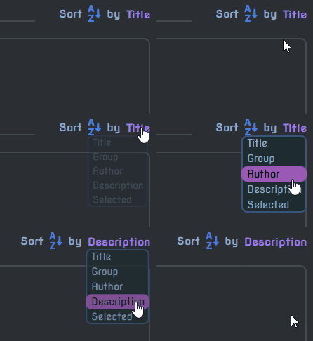
Pick up form
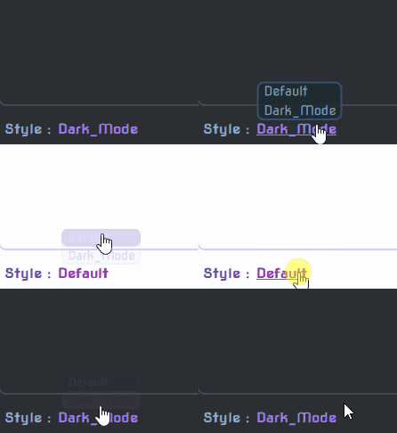
It has the following color keys:
backgroundborderinactiveText-
activeText(Hovered or pressed) -
scrollBG- (Background for scrollbar) -
scrollHandle- (Scrollbar handle color)|
Just like the drawer of a cupboard, this control is kept hidden on the sides of the Window and pulled out when necessary.
It houses a bunch of ActionItems inside.
There are 2 drawers in Main GUI (on left and right) and 1 drawer each in Test Bench as well as Script Window (both on left) respectively.
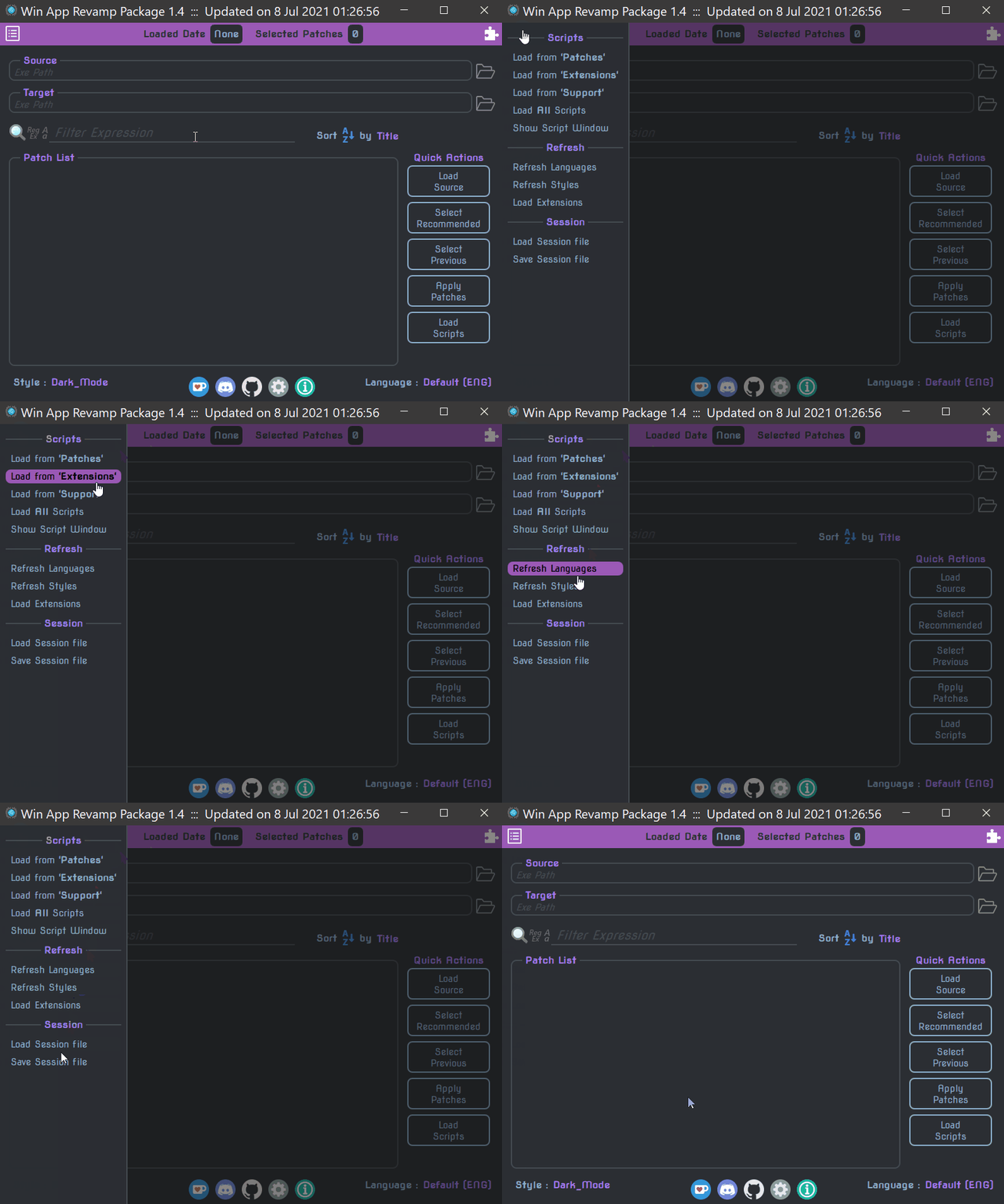
It has the following color keys:
backgroundborder-
overlay(Used behind the drawer for dimming)
A drawer is composed of these controls inside. Each of them have a specific associated action (hence the name).
It has the following color keys:
inactiveBGhoveredBGinactiveTexthoveredTextdisabledText-
tipBG(Background for tooltip) -
tipBorder(Border for tooltip) -
tipText(Text color for tooltip)
These controls are simply used for displaying some form of information.
As the name suggests this is a frame (essentially a wrapper displayed as a rounded box) containing a title used to house a group of controls.
You will see almost all of the lists being wrapped inside a TitledFrame.
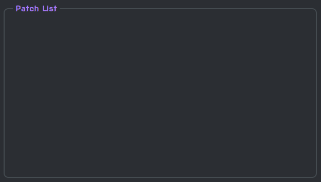
It has the following color keys:
backgroundbordertext-
scrollBG(Background for scrollbar when the frame wraps a list) -
scrollHandle(Scrollbar handle color)
Just a label showing some information (usually used as a prompt).

It has just 1 color key which is literally color.
The name is pretty much self-explanatory. For e.g. the search icon next to the Filter & Sort controls in Main GUI.

These don't have any color keys but they do usually have a indicator path for the 'image' being displayed.
Now on to the dialogs (the extra windows that pop up within the primary window)
Just like the name says these are simple pop-ups that either shows the user a certain error/warning/success/general information OR post a Yes/No query.
Naturally there are 4 types of MessageBoxes that show up in WARP.
-
For Error
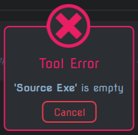
-
For Warning
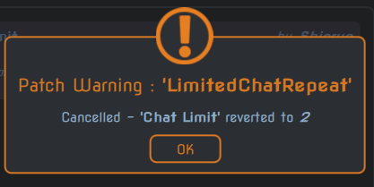
-
For Success & General Info
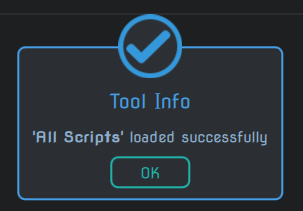
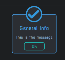
-
For Query
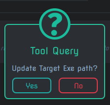
All of them have the following color keys:
backgroundborder-
overlay(Used behind the dialog for dimming) text
and the path key msgHeader for the icon being displayed on top.
A settings dialog is used to check/uncheck various options and additionally save the resolutions of the various UI.
All the settings dialogs have the name settingsBox.
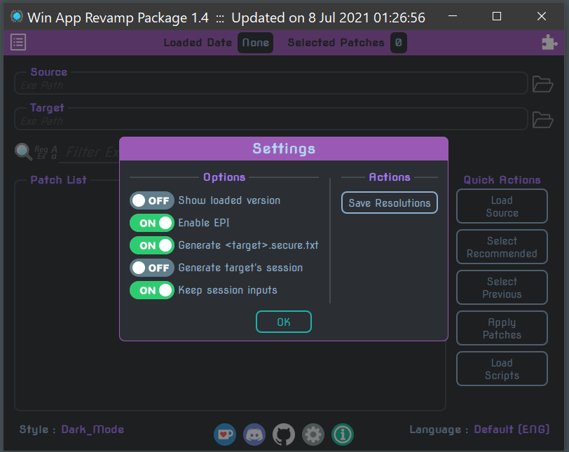
It has the following color keys:
backgroundborder-
overlay(Used behind the dialog for dimming) text-
headerText(Seperate color for the 'Settings' header)
This dialog simply display some information about the tool itself.
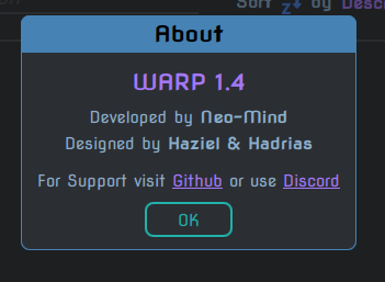
It has the following color keys:
backgroundborder-
overlay(Used behind the dialog for dimming) text-
headerText(Seperate color for the 'About' header) -
titleText(Seperate color for the 'WARP version' title) -
linkText(Seperate color for the links)
This is used only in the Test Bench. The 4 tabs are grouped into a TabSet named tabs.
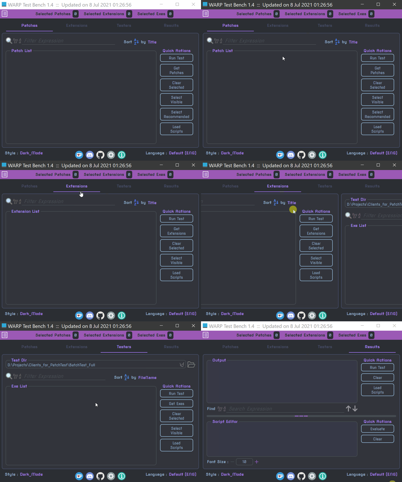
It has 2 color keys:
background-
line(Color of the line placed under the active tabhead)
Each part of a TabSet has 2 parts i.e. the TabHead and the Page attached to it.
The tab head is basically the top part of each tab that displays the name of the tab i.e. Patches, Extensions, Testers and Results
It has 2 color keys:
inactiveTextactiveText
This is the body of each tab coming under the tab head.
It has 2 color keys:
backgroundborder
Remember to keep a distinguishing color from the global background otherwise it will be difficult to identify the page
This is the pop-up menu which appears when you right click on one of the Input fields.
It has all the text based actions like Cut, Copy, Paste etc..
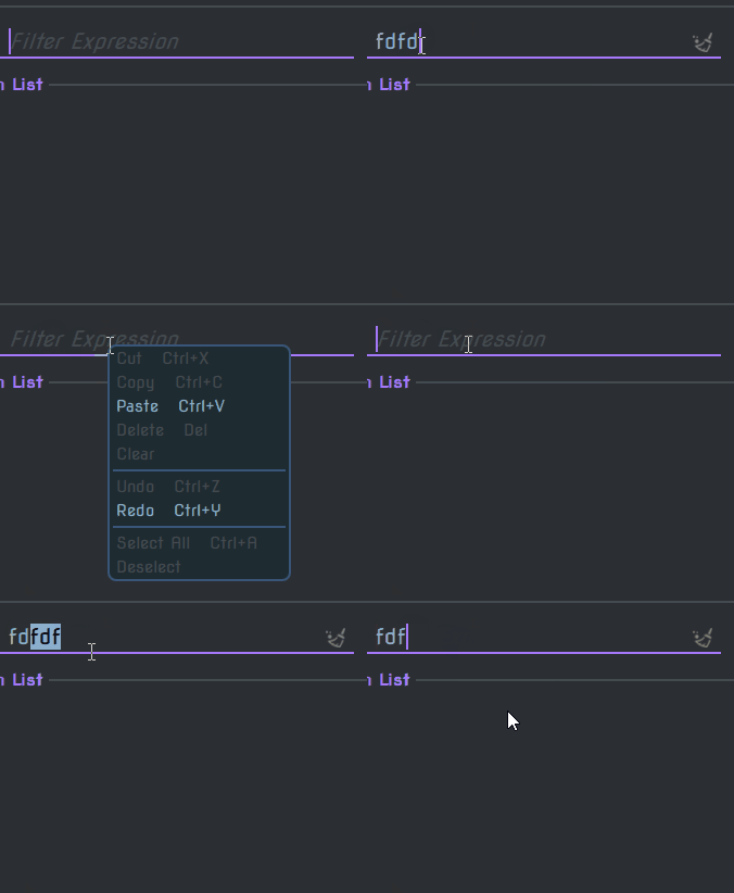
It has the following color keys:
backgroundborder-
overlay(Used behind the menu for dimming)
There is only 1 context menu which gets used across the entire tool and it is named contextMenu.
These are the custom controls used in the Patch List as well as the 3 lists in Test Bench
Uses all the details of a patch to display a 'selectable entity' in the patch list. Refer Writing Patches for more details.

It has the following color keys:
backgroundselectedBGtextselectedText-
groupText(Default color for the patch group)
This is only available in the Extensions tab.
It uses all the details of an extension to display a 'selectable entity' in the extension list. Refer Writing Extensions for more details.

It has the following color keys:
backgroundselectedBGtextselectedText
This is only available in the Testers tab. It displays an exe's filename as a 'selectable entity' in the exe list.

It has the following color keys:
backgroundselectedBGtextselectedText
This is the automatic scrollbar that pops up when you try to scroll through a list (either by rolling the mouse wheel OR literally dragging the list up/down).
It is not restricted to a list however, as any control that can be scrolled can use this.
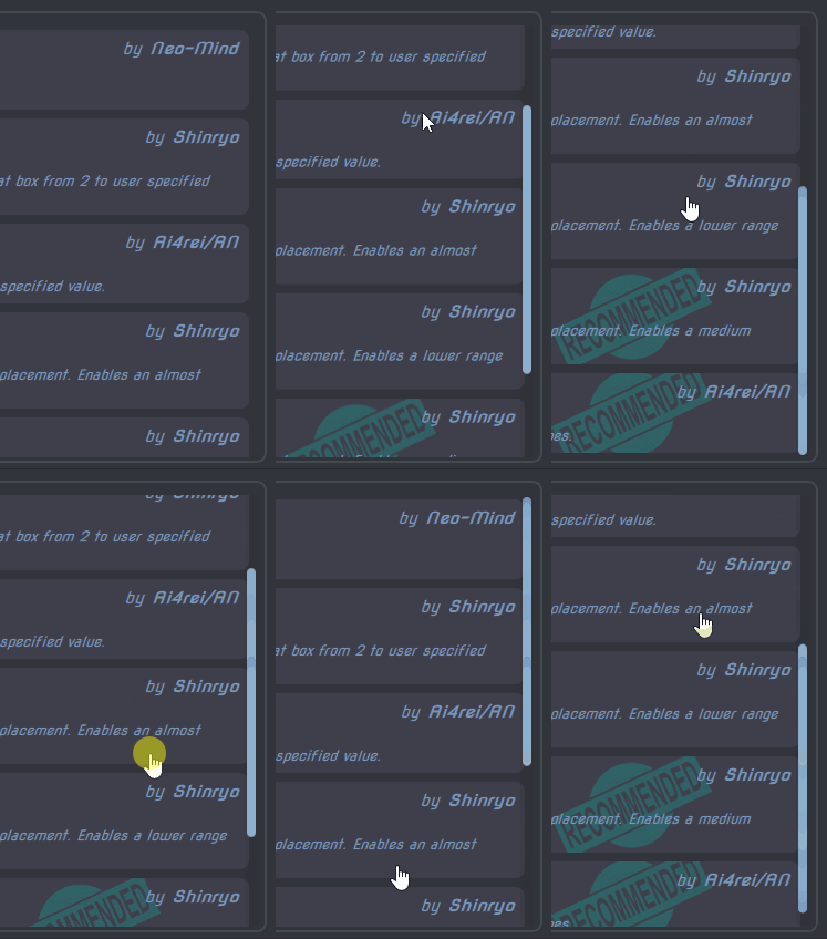
It has the following color keys:
scrollBGscrollHandle
The keys have the scroll prefix just to avoid conflict, since the name of a Scroller is often shared with it's parent control.
A wrapper over other controls enabling the use of a Scroller.
At present only used for wrapping TextEditor controls.
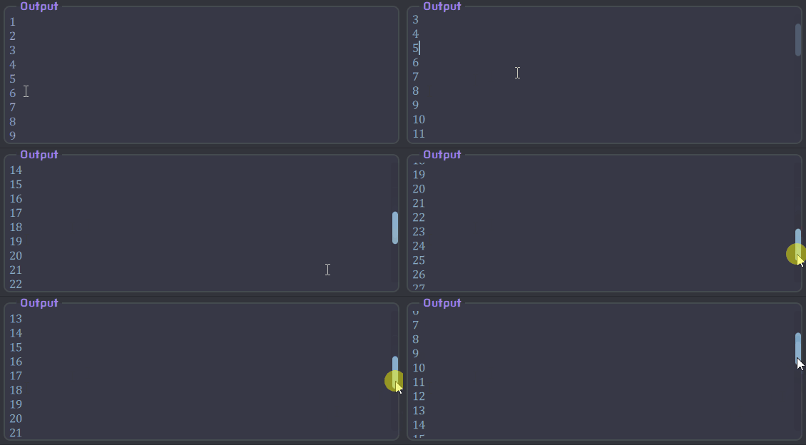
It has the following color keys:
backgroundbordertitleText
This is used to split the available area between 2 or more controls vertically. It provides a handle in between the controls for adjusting their sizes.
Currently, it is only used in Script Window & Results tab of Test Bench.

It has the following color keys:
inactiveHandlehoveredHandlepressedHandle
A vertical slider to select value from 0 to the maximum. Currently only used in [Input dialog] for D_Color types.
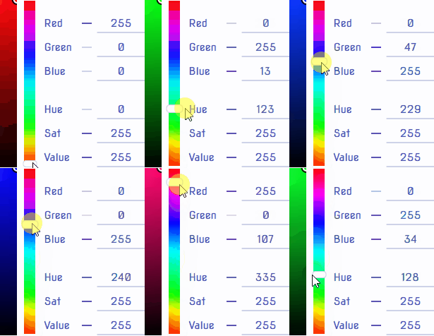
It has the following color keys:
handleBGhandleBorder