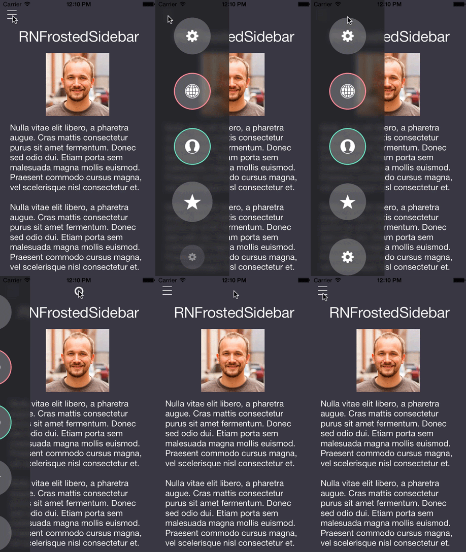
Add your own Control Center-esque UI to your app to work as navigation or even toggle different settings. Blend right into the new iOS 7 design with animated blurs, flat design, and custom animations.
This project is another UI control built after finding some inspiration on Dribbble. The original design was created by Jakub Antalik.
For some thoughts on live blur in iOS apps, check out my blog post.
You'll notice that this control's use of blur does not match Jakub's original design exactly. In the original design the background of the buttons is blurred, while the overlay of the control is simply shaded. There have been attempts at recreating this effect, but it is rumored that live-blurring takes place at a much lower level on the GPU and there would be security concerns were we to have access.
Apple is being a little deceptive with their use of blurring in iOS 7. Bottom line, don't animate blurs in your designs.
If you examine the source of this project you'll see that I'm actually cheating to get the blur layer to animate overtop the original view.
The preferred method of installation is with CocoaPods. Just add this line to your Podfile.
pod 'RNFrostedSidebar', '~> 0.2.0'
Or if you want to install manually, drag and drop the RNFrostedSidebar .h and .m files into your project. To get this working, you'll need to include the following frameworks in Link Binary with Libraries:
- QuartzCore
- Accelerate
The simplest usage is to create a list of images, initialize a RNFrostedSidebar object, then call the -show method.
NSArray *images = @[
                    [UIImage imageNamed:@"gear"],
                    [UIImage imageNamed:@"globe"],
                    [UIImage imageNamed:@"profile"],
                    [UIImage imageNamed:@"star"]
                    ];

RNFrostedSidebar *callout = [[RNFrostedSidebar alloc] initWithImages:images];
callout.delegate = self;
[callout show];
If you use RNFrostedSidebar with a UINavigationController, you can push another UIViewController after selecting a button.
Simply initialize it in sidebar:didTapItemAtIndex:, then push it onto the navigation stack after dimissing the sidebar with -dismissAnimated:completion:.
- (void)sidebar:(RNFrostedSidebar *)sidebar didTapItemAtIndex:(NSUInteger)index {
    if (index == 1) {
        [sidebar dismissAnimated:YES completion:^(BOOL finished) {
            if (finished) {
                UIViewController *secondVC = [[UIViewController alloc] init];
                [self.navigationController pushViewController:secondVC animated:YES];
            }
        }];
    }
}I've exposed a healthy amount of options for you to customize the appearance and animation of the control.
- (instancetype)initWithImages:(NSArray *)images selectedIndices:(NSIndexSet *)selectedIndices;Use the parameter selectedIndices to add pre-selected options. Without using the init method below there wont be any visualization of selection. But, you will get the proper enabled/disabled BOOL in the delegate -sidebar:didEnable:itemAtIndex: method.
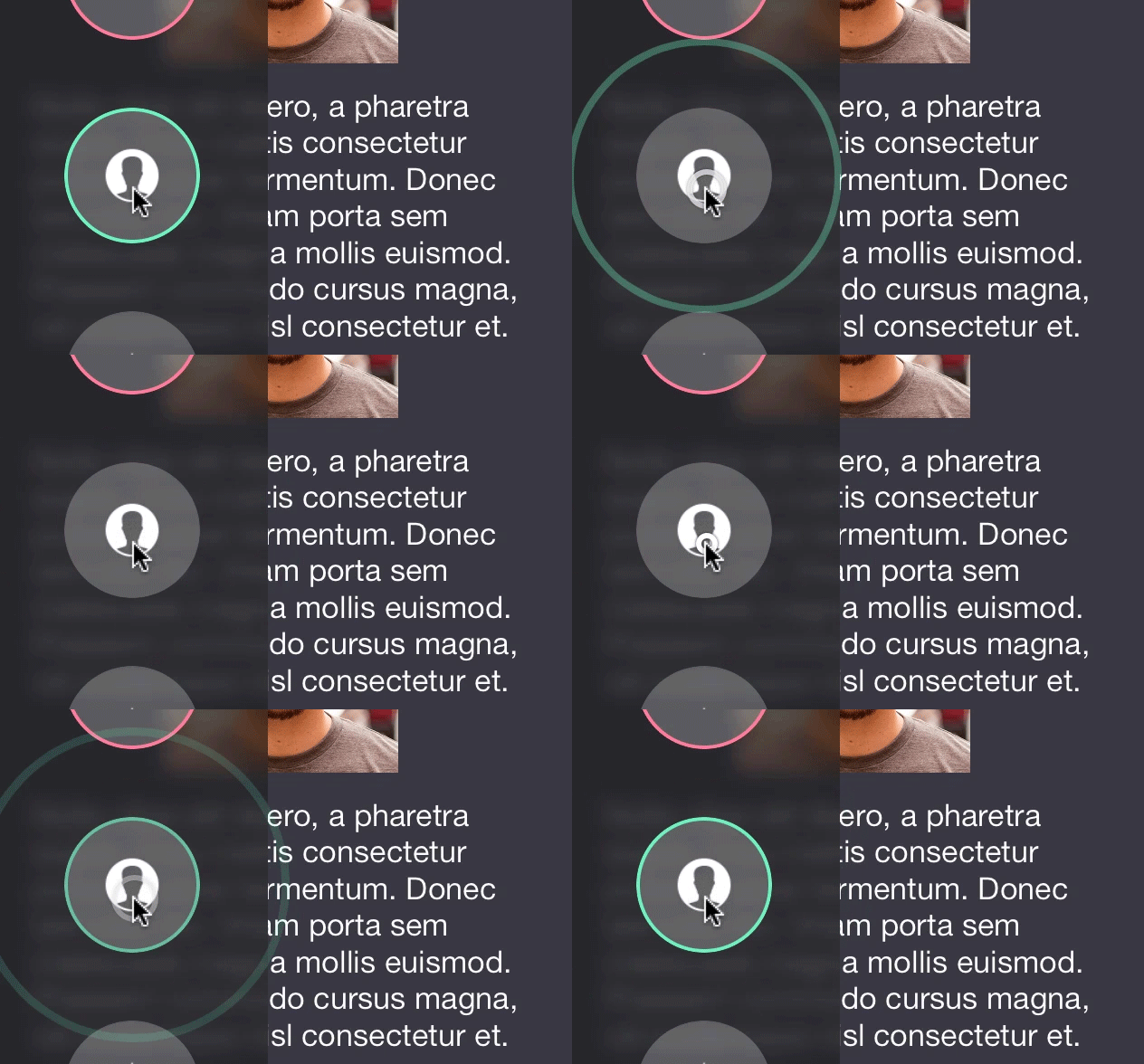
- (instancetype)initWithImages:(NSArray *)images selectedIndices:(NSIndexSet *)selectedIndices borderColors:(NSArray *)colors;Use the parameter borderColors to add border effect animations when selecting and deselecting a view.
@property (nonatomic, assign) CGFloat width;The width of the blurred region. Default 150.
@property (nonatomic, assign) BOOL showFromRight;Toggle showing the control from the right side of the device. Default NO.
@property (nonatomic, assign) CGFloat animationDuration;The duration of the show and dismiss animations. Default 0.25.
@property (nonatomic, assign) CGSize itemSize;The size of the item views. Default is width: 75, height: 75.
@property (nonatomic, strong) UIColor *tintColor;The tint color of the blur. This can be a tricky property to set. I recommend using the provided alpha. Avoid using solid colors with an alpha of 1. Default white: 0.2, alpha: 0.73.
@property (nonatomic, strong) UIColor *itemBackgroundColor;The background color for item views. Note: This property must be set with either colorWithWhite:alpha or colorWithRed:green:blue:alpha or it will crash. This is for highlight effects on tapping so the control can derive a darker background when highlighted. Default white: 1, alpha 0.25.
@property (nonatomic, assign) NSUInteger borderWidth;The border width for item views. Default 2.
@property (nonatomic, weak) id <RNFrostedSidebarDelegate> delegate;An optional delegate to respond to selection of item views. Optional delegate methods, provided by George Villasboas, include:
- (void)sidebar:(RNFrostedSidebar *)sidebar willShowOnScreenAnimated:(BOOL)animatedYesOrNo;
- (void)sidebar:(RNFrostedSidebar *)sidebar didShowOnScreenAnimated:(BOOL)animatedYesOrNo;
- (void)sidebar:(RNFrostedSidebar *)sidebar willDismissFromScreenAnimated:(BOOL)animatedYesOrNo;
- (void)sidebar:(RNFrostedSidebar *)sidebar didDismissFromScreenAnimated:(BOOL)animatedYesOrNo;
- (void)sidebar:(RNFrostedSidebar *)sidebar didTapItemAtIndex:(NSUInteger)index;
- (void)sidebar:(RNFrostedSidebar *)sidebar didEnable:(BOOL)itemEnabled itemAtIndex:(NSUInteger)index;UI Control structure and View Controller containment practices adopted from Matthias Tretter.
Sample icons provided by Pixeden.
The blur algorithm comes from WWDC 2013's session 208, "What's New in iOS User Interface Design".
If you've used this project in a live app, please let me know! Nothing makes me happier than seeing someone else take my work and go wild with it.
- @nystrorm on Twitter
- @rnystrom on Github
- rnystrom [at] whoisryannystrom [dot] com
See LICENSE.

