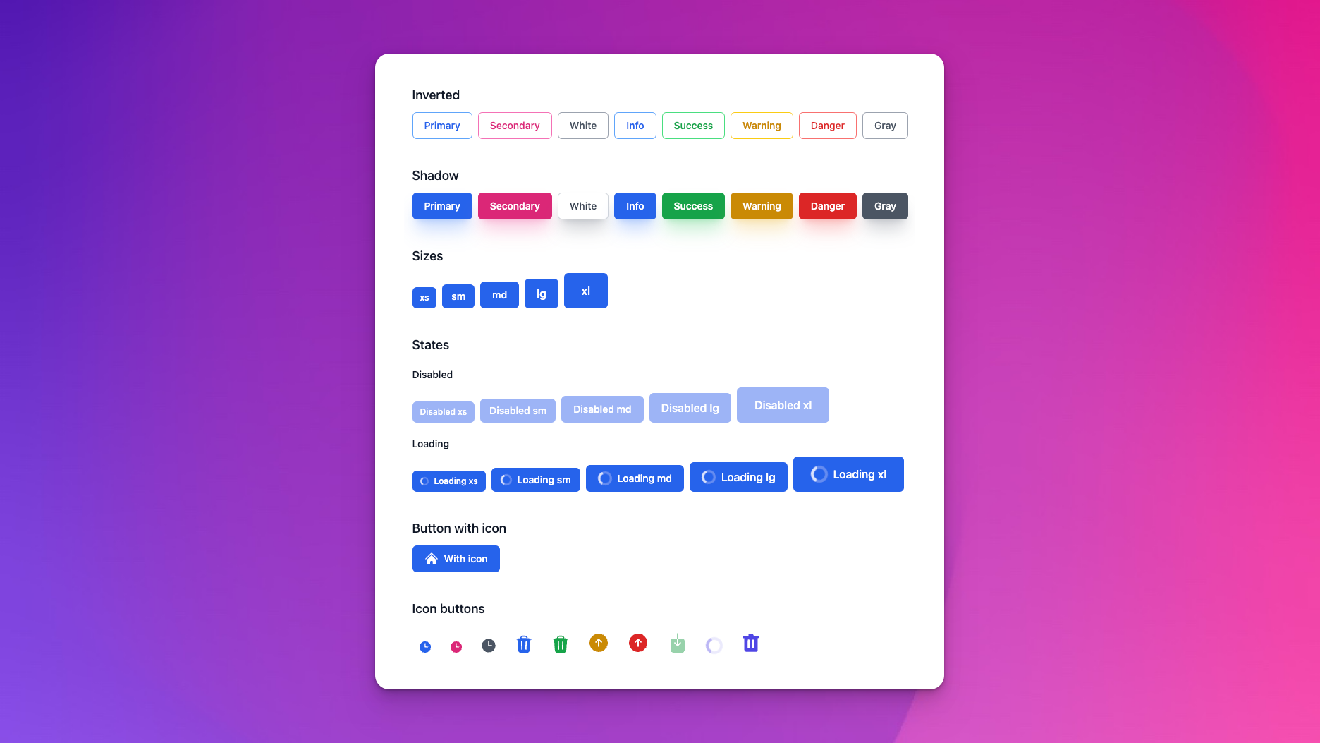
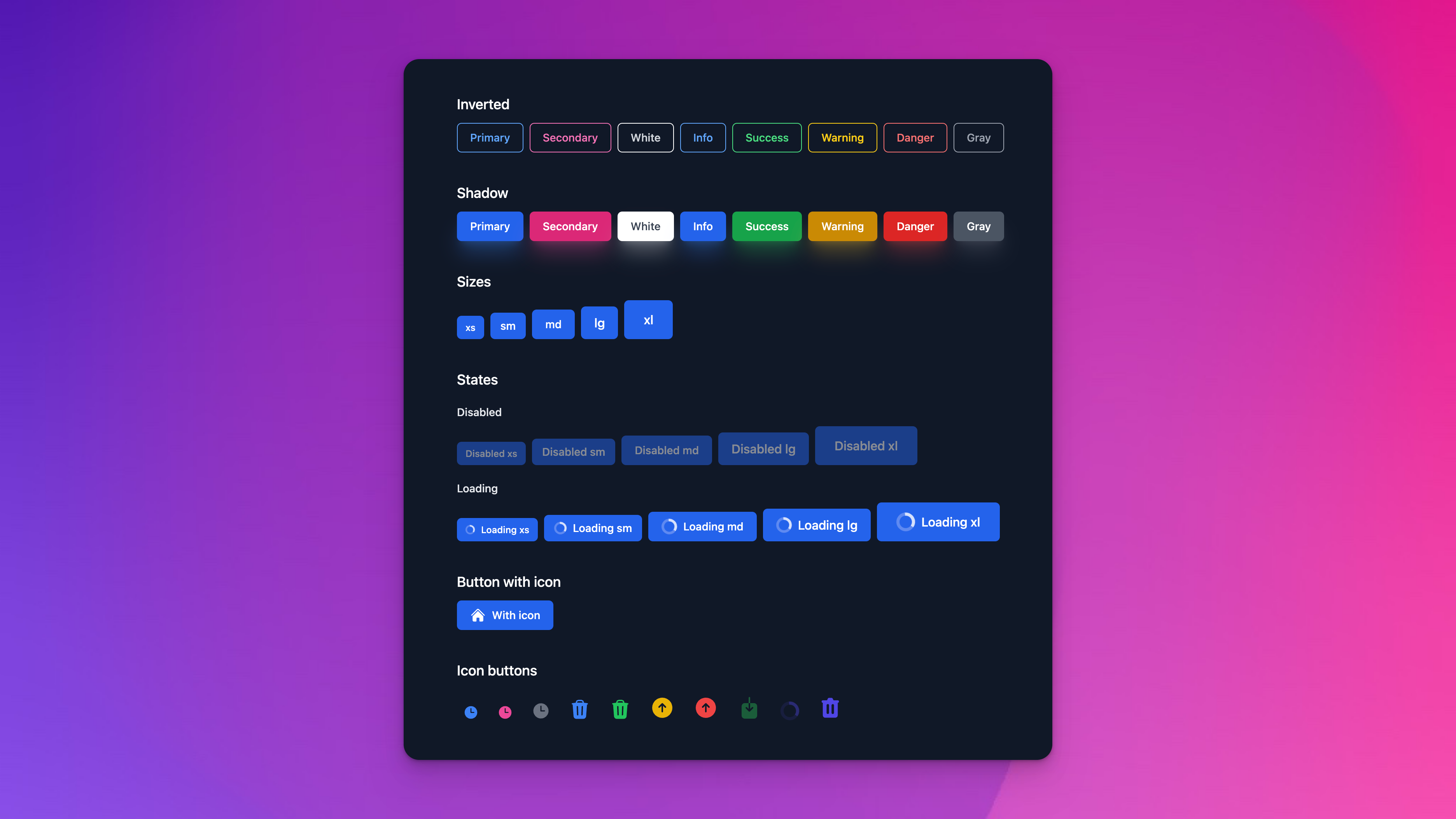
Petal is a set of HEEX components that makes it easy for Phoenix developers to build beautiful web apps. Think Bootstrap or MUI, but written in HEEX using Tailwind CSS classes. Work in both live and dead (controller) views.
Petal stands for:
- Phoenix
- Elixir
- Tailwind CSS
- Alpine JS (optional)
- Live View (HEEX)
Some components like Dropdowns require Javascript to work. We default to Alpine JS (17kb) but you can choose to use Phoenix.LiveView.JS as an alternative (though this will only work in live environments like live views or live components).
For full documentation, visit petal.build.
We have a fresh Phoenix boilerplate template with Petal Components ready to go if you would like to get your hands dirty.
Install our VSCode extension to gain access to 65+ snippets for all of the components.
We’ve released an official Figma UI kit for Petal. This kit includes all the open source and pro components you need to design your app in Figma.
- container
- text input
- select dropdown
- textarea
- checkbox
- radios
- errors
- labels
- file upload
- text variants (email, password, tel)
- color input
- range input
- time, datetime, & date input
- multiple select (see checkbox group)
- switch
- input help text
- input prefix and postfix
- basic button
- change size
- change color
- loading state (with spinner)
- filled vs outline
- button group
- menu dropdown
- avatar
- alerts
- tables
- cards
- breadcrumbs
- modal
- slide over
- spinners
- accordion
- pagination
- badges
- progress
- links
Q: Do I need Alpine JS? A: No we have designed the components to use either Alpine JS or LiveView.JS.
Q: What if I want to use my own components too? A: You can install this library and import only the components you need.
# The recommended option is to import every single component
use PetalComponents

# But you can get more granular. eg.

# Import Button so you can now create `<.button>` components
import PetalComponents.Button

# Or just alias if you already have a `def button` HEEX component. With alias you now write the Petal component like this: `<Button.button>`
alias PetalComponents.Button
Q: Does this increase my CSS filesize?
A: Tailwind will scan any folders you specify and hoover up CSS classes from files to include in your final CSS file. You specify the folders in tailwind.config.js. By default, we instruct you to just scan the whole Petal Components library:
const colors = require("tailwindcss/colors");

module.exports = {
  purge: [
    "../lib/*_web/**/*.*ex",
    "./js/**/*.js",

    // We need to include the Petal dependency so the classes get picked up by JIT.
    "../deps/petal_components/**/*.*ex"
  ],

  ... rest of file omitted
You might be worried that if you don't use every component you'll have unused CSS classes. But we believe it's so small it won't matter. Our petal.build site's CSS file totals just 25kb.
If you really want to you can instruct Tailwind to just scan the components you use:
"../deps/petal_components/lib/button.ex",
"../deps/petal_components/lib/alert.ex",
Q: Can I customize the components? A: Yes! You can customize the components by overriding the CSS classes. For example, if you want to change the color of the button you can do this:
.pc-button {
  @apply inline-flex items-center justify-center font-semibold tracking-wider uppercase transition duration-150 ease-in-out border-2 rounded-none focus:outline-none;
}
.pc-button--primary {
  @apply text-black border-black bg-primary-400 hover:bg-primary-700 focus:bg-primary-700 active:bg-primary-800 focus:shadow-primary-500/50;
}If you have a suggestion for a new component, you can add it here on our roadmap.
If you'd like to help out we've got a Phoenix umbrella app that allows you to easily contribute to Petal Components (which is installed as a git submodule). If you create a new component then feel free to submit a PR. Ideally one from the roadmap but we're open to any new components that would benefit others!
Looking to talk Petal with fellow devs? Join our great community over at our discord. For regular updates, consider signing up to petal.build and if you have any questions feel free to reach out to us at [email protected].


