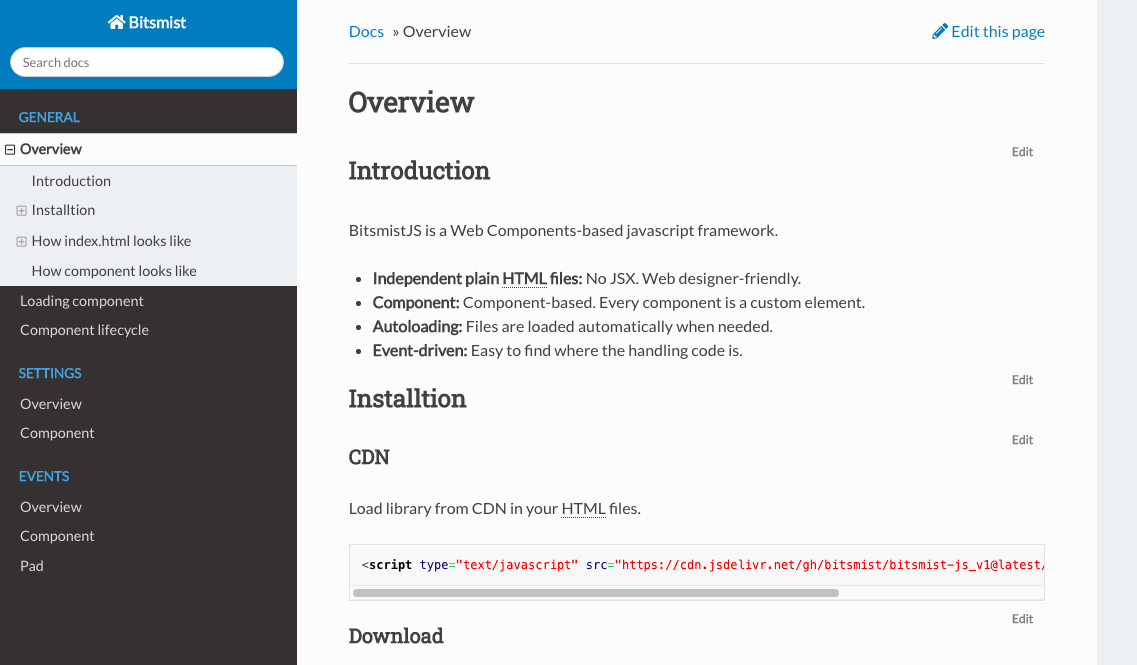
This is a Dokuwiki theme that imitates "Read the Docs".
Featuring:
- “Read the Docs” appearance
- Embedded foldable TOC in the sidebar
- Auto generated “Previous”, “Next” buttons to follow the pages on the sidebar
Use Dokuwiki's Extention Manager to install the template. If you want to install manually, you can download from here.
These are template settings for this theme.
| Option | Description |
|---|---|
| Sidebar position | "left" for left sidebar, "right" for right sidebar. |
| Use Dokuwiki breadcrums | Use Dokuwiki style breadcrumbs. |
| Start Page | Set start page url. |
These are some of the options on "Template Style Settings".
| Option | Description |
|---|---|
| Site width | Width of the whole content including the sidebar. By setting this value, the contents will be centered. |
| Content width | Content width. This is a maximum width so the actual size could be less than this value. |
| Side bar width | Sidebar width. |
| Header height | Header height. The theme puts padding on the top of the page according to this value. |
| Footer height | Footer height. The theme puts padding on the bottom of the page according to this value. |
| CSS breakpoint for smart phones | Screen size less than this value will be treated as a smartphone. |
| CSS breakpoint for tablets | Screen size less than this value will be treated as a tablet. |
Use strong for captions, lists of links for items. Anything other than that won't be styled, so use your own styles for them.
E.g.
** Caption1 **
  * [[page1]]
  * [[page2]]
** Caption2 **
  * [[page3]]
  * [[page4]]
Previous/Next buttons follow links to dokuwiki on the sidebar, picked up by using querySelector(".aside > #sidebar a[data-wiki-id]"). The previous button on the first page will jump to root(/) by default. You can change this in "Start Page" option in the settings.
This theme doesn't have any links to the login page. Go directly to the login page by appending "&do=login" to the current URL.
This theme has "Read The Docs" style admonitions. To use them, wrap a content with a div that has a class "admonition" and a type.
E.g.
<html><div class="admonition note">
<p>Note!</p>
</div></html>
Types are:
- danger
- caution
- note
- tip
You can use "Wrap Plugin" to make it a bit simpler.
<WRAP admonition note>
Note!
</WRAP>
If you use the plugin, do not forget to add classes to the "noPrefix" plugin option otherwise admonitions will not be styled correctly. You need to add four types listed above and "admonition" to the option value.
Even though this theme works without Font Awesome, you can use Font Awesome for better looking. If you decide to use it, check the option in the configuration manager to enable it. Do not forget to set the correct tag in the following option.
A home icon will appear beside the title, and +/- buttons on TOC, a mobile menu button will be replaced by Font Awesome.
Also, you can use google fonts for better looking. Lato and Robot fonts are set in font-family in this theme CSS. If you decide to use it, check the option in the configuration manager to enable it. Change the tags in the following option.
This theme supports a fixed header and footer. On the "Template Style Setting" page, enter a header height in the "Header height" option, a footer height in the "Footer height" option. The theme will add paddings according to those options on top for header, bottom for footer. You can put your own header/footer in "header.html"/"footer.html" in the "lib/tbl/readthedokus/" directory.
These values must be valid css values.
e.g. "50px"
Create a file "header.html"/"footer.html" under (dokuwiki folder)/lib/tpl/readthedokus/.
Here is a sample header.html. This example also shows how to toggle a sidebar. Clicking the string "Header" toggles the sidebar.
<div onclick="toggleMenu();">Header</div>
<style>
header > div {
	background-color: khaki;
	position: fixed;
	height: 50px;
	left: 0;
	top: 0;
	right: 0;
}
</style>
<script>
function toggleMenu()
{
	dokus.toggleSidebar();
}
</script>
You might want to hide a mobile menu since both the sticky header and the mobile menu are displayed at the same time on mobile devices. To hide the mobile menu add below to CSS file (dokuwiki folder)/conf/userall.css
#mobileheader {
display: none;
}
To center the content, enter the content width in the "Site width" option on the "Template Style Settings".
The theme has some include-hooks.
+--------------------------------------------------+
|                       [1]                        |
+-------------+------------------------------------+
|    Title    | Docs > Page Title                  |
|(           )|                [6]                 |
|     [2]     | ---------------------------------- |
+-------------+                                    |
|     [3]     |                                    |
|             |                                    |
|             |                                    |
|             |                                    |
|             |                                    |
|             |                                    |
|             |                                    |
|             |                                    |
|             |                                    |
|     [4]     | <Previous                    Next> |
+-------------+                                    |
|     [5]     |                [7]                 |
+-------------+------------------------------------+
|                       [8]                        |
+--------------------------------------------------+


[1] ... header.html
[2] ... sidebarheader.html
[3] ... sidebartop.html
[4] ... sidebarbottom.html
[5] ... sidebarfooter.html
[6] ... pageheader.html
[7] ... pagefooter.html
[8] ... footer.html
