-
Notifications
You must be signed in to change notification settings - Fork 30
New issue
Have a question about this project? Sign up for a free GitHub account to open an issue and contact its maintainers and the community.
By clicking “Sign up for GitHub”, you agree to our terms of service and privacy statement. We’ll occasionally send you account related emails.
Already on GitHub? Sign in to your account
Harder colors only to user menu area (like Chrome OS) #68
Comments
|
(i spent some more time playing around with CSS and came up with code below) I dont know how the extensions work and how they change the CSS theme files, but i hope someone knows and can add this, so you would have a switch in your extension that turns on this code and make the panel look like ChromeOS. (sorry for my ignorance, as probably is not as easy as it sounds). Anyways, here is the CSS: .show-apps .overview-icon .show-apps-icon { .show-apps .overview-icon{ .show-apps:hover .overview-icon, .show-apps:focus .overview-icon, .show-apps:selected .overview-icon { #panelRight{ |
|
Hi! Yes, this could very well be possible. I'll tag it as a feature request and see if I can't add it in. I'm currently doing a major rewrite for 3.24+ (Gnome finally fixed bugs that prevented me from fully using CSS). I probably will only be able to write this as a feature for 3.24+ as bugs in 3.22 and lower will likely prevent a workable solution. After the rewrite I'll be sure to pick this up! Thanks for contributing, |
|
I actually have this setup on my system at the moment and it looks really good. Its easy enough to just slightly modify the shell theme but it would be cool to add as a feature. I saw it over here with a pretty good explanation of how to set it up. Link. |
|
I've started work on this and it may be added to the extension pending further testing/work. My current plan is to support darkening the right and/or left panel exclusively. |

Firstly, amazing extension. Cant use the shell without it.
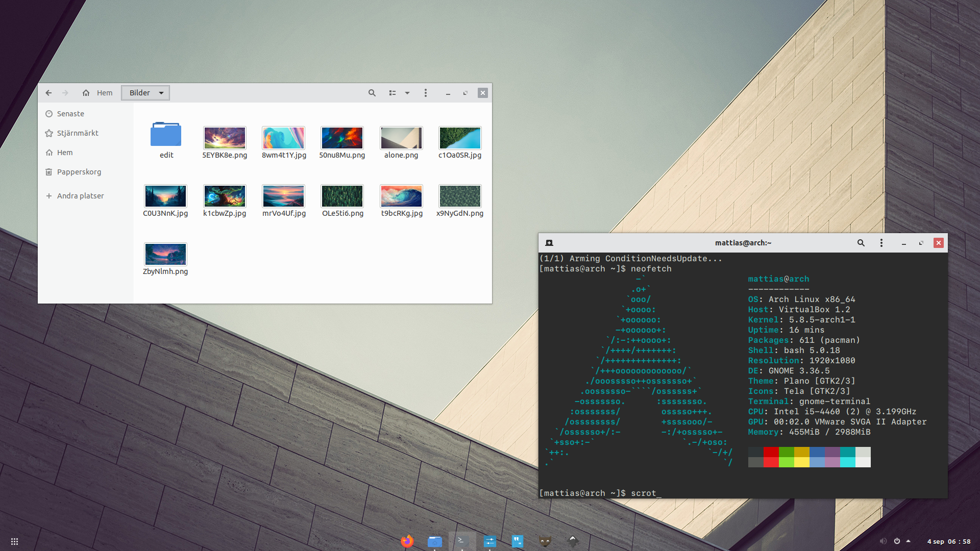
I was thinking (and since i have no clue in JS) i am wishing, can something like the picture below be implemented? The harder color only to user menu.
Because as of now, i am using different shell theme and gtk theme just to have that. it looks cool. Like the ChromeOS.
Here is the link to the shell theme :)

https://github.com/lassekongo83/plano-theme
The text was updated successfully, but these errors were encountered: