This repo is part of the philu set of repos, that create the philanthropyu.org website


We are not accepting public contributions to this repo at this time.
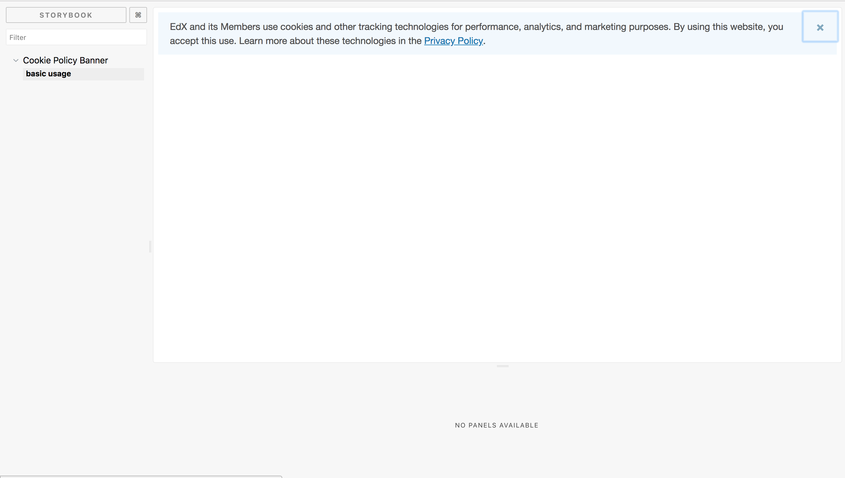
This is an RG specific fork of the cookie policy banner component.
- Translations are hardcoded for now and have only EN and ES versions. See the translations how-to doc for details.
- Sync process with the upstream will be complicated according to the quantity of changes. There is an ongoing work in the upsteam aimed at the component refactor though. We're planning to participate there to ease the sync process in the future.
- As for now, the component usage in the legacy frontend is possible though not tested/recommended. We're going either to unify the behavior of the react-based cookie baner and our theme's banner or adopt the component for the legacy frontend.
- We're also started the discussion in the community about adding the cookie banner component to the Header component to avoid behavior when the banner isn't shown in any MFE but in the Authn.
edX cookie policy banner React component
npm i --save @edx/frontend-component-cookie-policy-bannerimport CookiePolicyBanner from '@edx/frontend-component-cookie-policy-banner';
// Can import sass file this way
// Or as an import in one of your sass files with other third party sass files
import '@edx/frontend-component-cookie-policy-banner/build/frontend-component-cookie-policy-banner.scss';
const SomeWrappingComponent = () => (
<div>
<span>Blahblablah</span>
<CookiePolicyBanner />
</div>
);We use semantic-release to update the package on NPM.
Please follow semantic-release guidelines on how to structure your commit message when merging a change.
As noted in a comment in the previous code example, you can import the styles associated with the CookiePolicyBanner component directly (if this is supported by your webpack config) or by importing the sass file as part of one of your existing sass files (probably where your other third-party sass files are imported).
| Requirement: | The CookiePolicyBanner sass file assumes the presence of an @edx/brand theme |
|---|
// base.scss
@import 'thirdPartySass';
@import 'anotherThirdPartySass';

// Theme styles
@import '@edx/brand/paragon/fonts';
@import '@edx/brand/paragon/variables';

// Cookie Policy Banner style
@import '@edx/frontend-component-cookie-policy-banner/build/frontend-component-cookie-policy-banner';The current build is not included in the git repository so in order to test the component with dependent repositories, you will have to first build the component by running npm run prepublishOnly, then remove build and build/Release from .gitignore and commit the results to your branch. Make sure to remove the change to .gitignore before merging!
Once you've committed and pushed the build to your branch, you can bring it into a dependent repository's package.json by adding
"@edx/frontend-component-cookie-policy-banner": "git+https://github.com/openedx/frontend-component-cookie-policy-banner#<my_branch_name>"
and running npm install.
Note that whenever you make changes on your branch, you will have to rebuild, commit push the resulting build artifacts, and re-run npm install in the dependent repository.
Storybook is a useful tool for showcasing the expected and potential usage of components.
Executing
As of Nov 2020, Storybook isn't compatible with webpack 5, so before running change your webpack version to 4.44.1.
npm run startlocally builds the Storybook for the CookiePolicyBanner component on port 3003.
https://open.edx.org/code-of-conduct/
You can contact the edx open-source team at [email protected].
Please do not report security issues in public. Send security concerns via email to [email protected].